
Table of Contents
jCheckBox
The jCheckbox control is analogous to the .Net Compact Framework's CheckBox, but has a much more rich appearance and a few additional features.
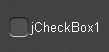
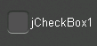
CheckBoxSize Property
The CheckBoxSize property changes the diameter of the check box.
 |  |
 |  |
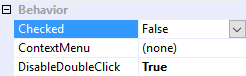
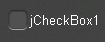
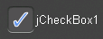
Checked Property
The Checked property changes the checkbox's state to either checked (true) or unchecked (false).
 |  |
 |  |
CheckedChanged Event
The CheckedChanged event fires any time the Checked property changes, and can therefore be used to respond to operator input.
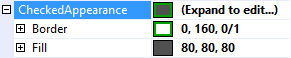
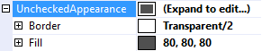
CheckedAppearance and UncheckedAppearance Properties
The CheckedAppearance property describes the appearance of the checkbox when it is in the checked state (i.e. Checked = true), and the UncheckedAppearance property describes the appearance of the checkbox when it is in the unchecked state (i.e. Checked = false). Please see Fills, Strokes, and Borders for more information on how to adjust these properties.
 |  |
 |  |
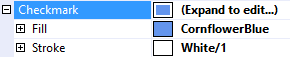
Checkmark Property
The CheckedAppearance property describes the appearance of the checkmark inside the checkbox. Please see Fills, Strokes, and Borders for more information on how to adjust these properties.
 |  |
CornerRadii Property
The CornerRadii property can be used to set shape of the checkbox's four corners when the Shape property is set to Rectangular. Each corner can be set independently.
DrawCheckmark Method
The DrawCheckmark method is a protected method that can be used to override the appearance of the checkmark. For example, the following class will draw an X shape instead of the default checkmark shape.
public class CustomCheckbox : jCheckBox
{
    protected override void DrawCheckmark(Rectangle checkboxRectangle, Rectangle clipRectangle)
    {
        Canvas.ClipRectangle = clipRectangle;

        float topLeftX = checkboxRectangle.Left + CornerRadii.TopLeft;
        float topLeftY = checkboxRectangle.Top + CornerRadii.TopLeft;
        float topRightX = checkboxRectangle.Right - CornerRadii.TopRight;
        float topRightY = checkboxRectangle.Top + CornerRadii.TopRight;
        float bottomLeftX = checkboxRectangle.Left + CornerRadii.BottomLeft;
        float bottomLeftY = checkboxRectangle.Bottom - CornerRadii.BottomLeft;
        float bottomRightX = checkboxRectangle.Right - CornerRadii.BottomRight;
        float bottomRightY = checkboxRectangle.Bottom - CornerRadii.BottomRight;

        using (var brush = Checkmark.Fill.GetBrush())
        {
            Canvas.Brush = brush;
            Canvas.StrokeThickness = CheckBoxSize / 10.0f;

            Canvas.FillLine(
                new PointF(topLeftX, topLeftY),
                new PointF(bottomRightX, bottomRightY));

            Canvas.FillLine(
                new PointF(topRightX, topRightY),
                new PointF(bottomLeftX, bottomLeftY));
        }
    }
}

Position Property
The Position property determines the position of the checkbox relative to its text. The TextAlignment property also aligns the checkbox with the text.
 |  |
 |  |
 |  |
 |  |
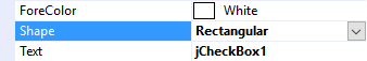
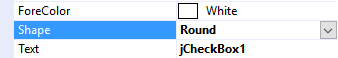
Shape Property
The Shape property can be used to select the overall shape of the checkbox: Rectangular or Round
 |  |
 |  |
Text Features
jCheckBox employs the same text features used by many of the other controls in the jControls CF35 library including ForeColor, TextOffset, TextAlignment, and TextWrap. See Text Features for more information.