
목차
jCheckBox
jCheckbox 콘트롤은 기존 .Net Compact Framework's CheckBox콘트롤을 발전시킨 것입니다.
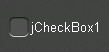
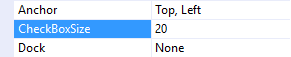
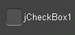
CheckBoxSize 속성
CheckBoxSize 속성을 바꾸면 체크박스의 크기가 바뀝니다.
 |  |
 |  |
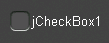
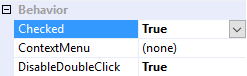
Checked 속성
Checked 속성을 통해 체크박스가 체크상태(true) 인지 아닌(false)지를 알 수 있습니다.
 |  |
 |  |
CheckedChanged 이벤트
Checked 속성이 바뀌면 CheckedChanged 이벤트가 발생합니다.
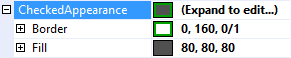
CheckedAppearance 와 UncheckedAppearance 속성
CheckedAppearance 속성은 체크박스가 체크되었을 때의 표시속성에 대한 내용을 포함하고 있습니다. UncheckedAppearance 속성은 체크박스가 체크되지 않았을 때의 표시속성에 대한 내용을 포함하고 있습니다. 표시속성에 대한 자세한 내용은 Fills, Strokes, and Borders 을 참조하시기 바랍니다.
 |  |
 |  |
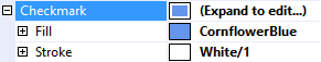
Checkmark 속성
CheckedAppearance 속성은 체크마크 표시에 관한 내용을 포함하고 있습니다. 자세한 내용은 Fills, Strokes, and Borders을 참조하시기 바랍니다.
 |  |
CornerRadii 속성
CornerRadii 속성은 체크박스의 모서리를 둥근정도를 결정해주는 속성입니다.
DrawCheckmark 메소드 함수
DrawCheckmark 메소드 함수는 protected 메소드 함수입니다. 이것을 오버라이딩해서 다른 모양으로 체크표시를 바꿀 수 있습니다. 아래의 예에서 처럼 X표시로 체크모양을 바꿀 수 있습니다.
public class CustomCheckbox : jCheckBox
{
    protected override void DrawCheckmark(Rectangle checkboxRectangle, Rectangle clipRectangle)
    {
        Canvas.ClipRectangle = clipRectangle;

        float topLeftX = checkboxRectangle.Left + CornerRadii.TopLeft;
        float topLeftY = checkboxRectangle.Top + CornerRadii.TopLeft;
        float topRightX = checkboxRectangle.Right - CornerRadii.TopRight;
        float topRightY = checkboxRectangle.Top + CornerRadii.TopRight;
        float bottomLeftX = checkboxRectangle.Left + CornerRadii.BottomLeft;
        float bottomLeftY = checkboxRectangle.Bottom - CornerRadii.BottomLeft;
        float bottomRightX = checkboxRectangle.Right - CornerRadii.BottomRight;
        float bottomRightY = checkboxRectangle.Bottom - CornerRadii.BottomRight;

        using (var brush = Checkmark.Fill.GetBrush())
        {
            Canvas.Brush = brush;
            Canvas.StrokeThickness = CheckBoxSize / 10.0f;

            Canvas.FillLine(
                new PointF(topLeftX, topLeftY),
                new PointF(bottomRightX, bottomRightY));

            Canvas.FillLine(
                new PointF(topRightX, topRightY),
                new PointF(bottomLeftX, bottomLeftY));
        }
    }
}

Position 속성
Position 속성은 체크박스의 위치를 결정하는 속성입니다. TextAlignment 속성은 텍스트의 정렬에 대한 내용을 포함하고 있습니다.
 |  |
 |  |
 |  |
 |  |
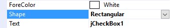
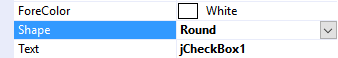
Shape 속성
Shape 속성은 체크박스를 둥글게 할것인지 네모로 할 것인지를 결정해줍니다. Rectangular 또는 Round중 하나를 선택하세요.
 |  |
 |  |
Text Features
jCheckBox는 다른 jControls CF35 콘트롤처럼 Text기능에 대한 다양한 표현을 적용시킬 수 있습니다. (ForeColor, TextOffset, TextAlignment, TextWrap). 자세한 내용은 Text Features을 참조하시기 바랍니다.