
Table of Contents
jRadioButton
The jRadioButton control is analagous to the .Net Compact Framework's RadioButton, but has a much more rich appearance and a few additional features.
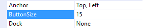
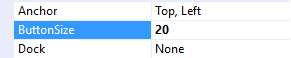
ButtonSize Property
The ButtonSize property changes the diameter of the radio button.
 |  |
 |  |
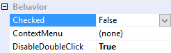
Checked Property
The Checked property changes the radio button's state to either checked (true) or unchecked (false).
 |  |
 |  |
CheckedChanged Event
The CheckedChanged event fires any time the Checked property changes, and can therefore be used to respond to operator input.
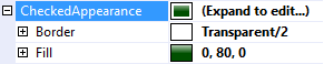
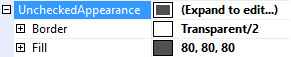
CheckedAppearance and UncheckedAppearance Properties
The CheckedAppearance property describes the appearance of the radio button when it is in the checked state (i.e. Checked = true), and the UncheckedAppearance property describes the appearance of the radio button when it is in the unchecked state (i.e. Checked = false). Please see Fills, Strokes, and Borders for more information on how to adjust these properties.
|  |
|  |
Group Property
The Group property places the jRadioButton into a mutually exclusive group. In the video below jRadioButton1, 2, and 3 are placed into one group, while jRadioButton4, 5, and 6 are placed into another group.
Group names are visible application-wide, so please be sure each group name is unique across the entire application. Contrary to the .Net Compact Framework's RadioButton control There is no need for each jRadioButton in a group to share a common parent.
Position Property
The Position property determines the position of the radio button relative to it's text. The TextAlignment property also aligns the radio button with the text.
 |  |
 |  |
 |  |
 |  |
Text Features
jRadioButton employs the same text features used by many of the other controls in the jControls CF35 library including ForeColor, TextOffset, TextAlignment, and TextWrap. See Text Features for more information.